As we approach Alpha, we’re busily testing and improving some of the new features Stuart discussed in a previous post. I’m going to build on that to discuss some of the exciting new features and improvements we’re bringing to the Digital Marketplace.
In addition to being guided by the GDS design principles and the design principles for the Digital Marketplace (more on that later), a major design goal is to reassure buyers that they’re buying the right thing, and to make sure buyers are supported throughout the buying process.
Our process begins with using insights and knowledge about buyers and suppliers to form hypotheses. Designs are sketched and prototyped in HTML, before being tested with real users. Most things are flexible and subject to change, and we iterate based on insights from user feedback, so here’s a disclaimer: designs discussed and shown in this post will probably change dramatically before the service goes live.
Better wayfinding
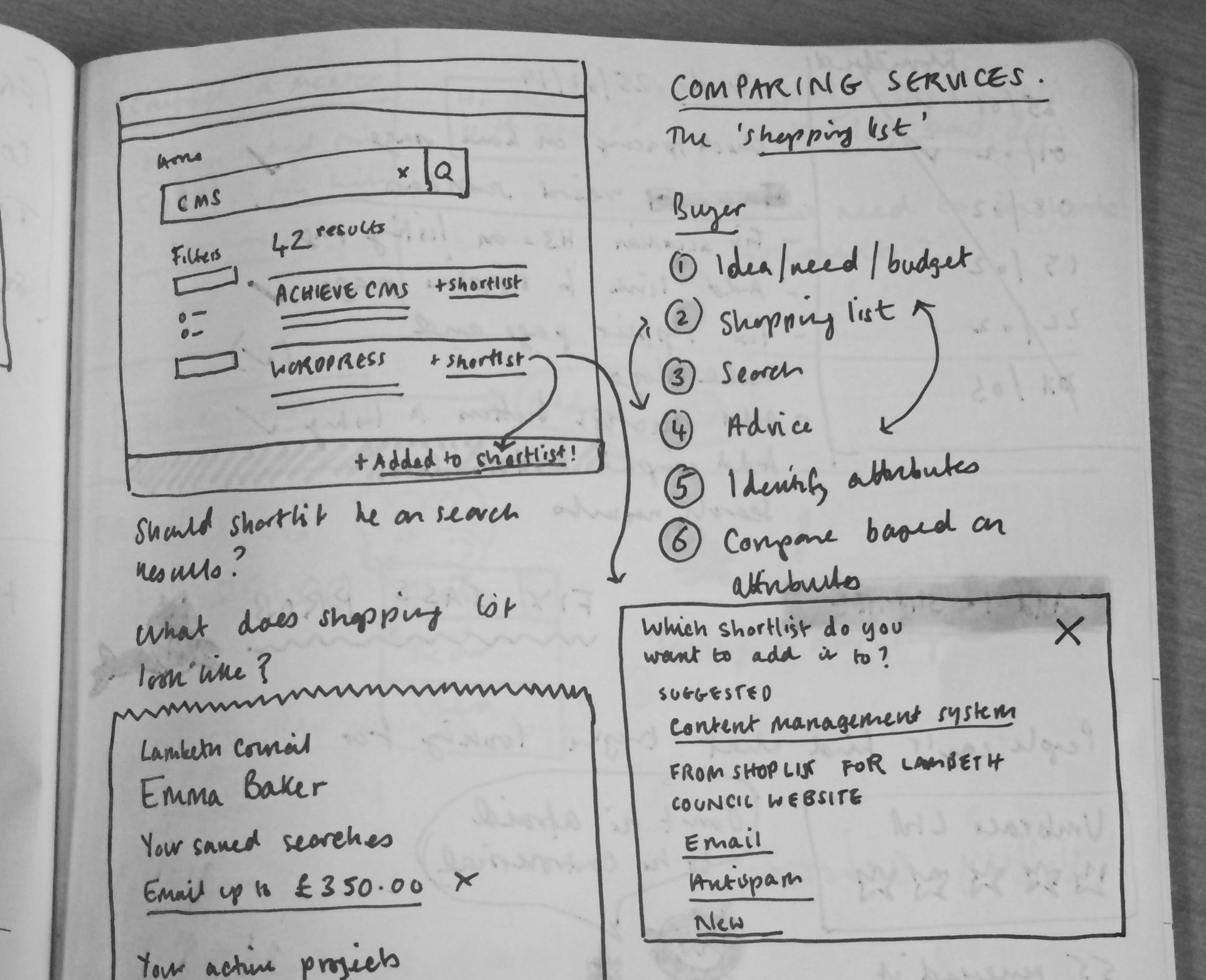
A problem with the current CloudStore is that it’s tricky to find the same search result twice, because the search results are randomised. We’re working on making it easier to find the service you need by improving browsing and searching.
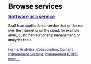
One way we’re doing that is by looking at language. The acronyms SaaS, PaaS, and IaaS mean something to those who know, but to those who are new to cloud services they are confusing. To help users understand the phrasing and categorisation, we’re looking at including a full phrase, an explanation of what it means, and some examples (the most popular) of what these services actually are (see screenshot below). But even with the full phrase, do our users know what “software as a service” means? (For those interested, Ivanka’s written previously about the importance of language.)
In addition to improving browsing, we’re addressing the search experience. We’re testing a design that shows how results are related to terms searched for. This could mean that, rather than randomised, results should appear in an order of relevance which you will be able to save as you go.
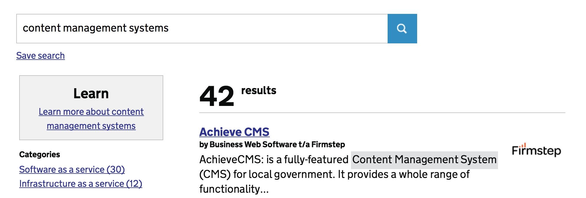
We’re aiming to provide help and support information, by providing information in the right place and at the right time that could be helpful to our users. For instance, someone searching for a CMS is invited to find out information as they’re searching for it.
One of the challenges will be displaying contextual help in the search results, that wouldn’t be mistaken for advertising.
Mini-feedback channels
Information quality is critical. One way we’re working on keeping information accurate and up-to-date is by opening up feedback loops across the service. A good example is the new questions and answers feature, where buyers can ask suppliers questions publicly on the site. The most useful questions and answers can be voted to the top so that they are easily seen.
Elsewhere, we’re testing lightweight feedback mechanisms so that users can tell us whether whether a product description is informative and contact us details are up to date and accurate. Enough “no” responses will bring problems to our attention, and perform a function of highlighting the most useful information.
Projects and shortlists
On commercial retail websites it’s common to favourite or bookmark things (like a house for sale on Rightmove, or a book on Amazon). Adding something to your shortlist on the Digital Marketplace is similar, except it would also allow you to record your reason for including it, for the purposes of an audit trail.
We’re currently testing Projects as a way to organise multiple shortlists. For example, if you’re working on creating a website you will need multiple things; including a CMS and hosting. A Project page, which contains shortlists, is one means of organising choices and recording how decisions are made. Later we’ll be designing and testing what adding collaborators to a project (or a shortlist) might look like.
What’s next?
We’re continuing to refine the designs for Alpha, and really appreciate your feedback. If you’re interested in participating in usability testing sessions, please do sign up here.
4 comments
Comment by Matt posted on
Any plans to fix the UX of the supplier side, the current admin interface is pretty poor.
Comment by Raphaelle Heaf posted on
Yes, we are looking at the full buyer and supplier journeys. We'll be keeping everyone updated with our progress.
Comment by Nikki posted on
Currently I can work down to a shortlist of suppliers using the filters, what is really frustrating is that I then browse to one supplier and when I hit the back button (there is no other function to return to previous) the filters are lost meaning I have to start from scratch. Also the Compare function loses the supplier name and therefore loses all meaning! Hope this is helpful feedback!! 🙂
Comment by Raphaelle Heaf posted on
Thank you for your feedback. If you would like to be part of our regular user testing group, then please <a href="https://digitalmarketplace.blog.gov.uk/2014/01/31/understanding-user-needs/">sign up here</a>