We blogged about what we’ve been doing to deliver the earliest usable product. Part of this process is looking at how buyers will be able to create and publish their requirements for a project.
To do this, we started with this buyer story:
As a buyer I need to be able to describe what I need in a clear way so that I can find the best supplier to deliver the work.
We also thought about the supplier needs and considered this supplier story:
As a supplier I need to understand what the buyer wants to achieve so that I can decide whether I’m interested in applying and have enough information to understand how I might deliver the outcome.
Researching user needs and existing solutions
Before starting to design the buying journey, we:
- spoke to users to understand their needs
- worked with the Crown Commercial Service (CCS) Managed Service team who help central government departments with their requirements
- looked at how we asked buyers to write requirements for Digital Services 1 and 2
- looked at business cases for budget approval
- researched how private sector buyers write their requirements
Our first prototype design was based on what we learnt from this research.
Testing version 1
When we tested our first prototype, we were looking out for how well users understood and interacted with the structure and the in-app guidance. To give our users access to a usable product as soon as possible, we used existing patterns and toolkits to reduce development time. We also asked the following questions:
- how well do buyers understand where publishing their requirements fits into the full buying journey?
- are the questions we’re asking helping buyers write clear requirements?
- do suppliers need anything else to decide whether to apply for an opportunity?
- how does the way we present guidance affect a buyer’s understanding?
Build. Measure. Learn.
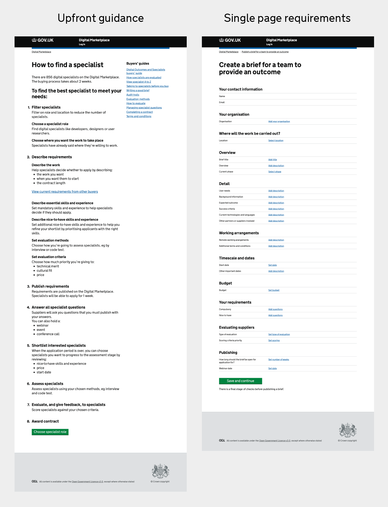
The answer to the last question significantly changed our prototype. We started off by presenting the guidance on the buying process in one big chunk as we thought buyers may find it helpful to see a detailed overview of the whole journey upfront. In our first version, buyers completed all their requirements on a single long page.
The prototype pages looked like this:
Iterating in response to user research findings
Although most buyers liked having this amount of guidance, the user research session showed that it’s difficult to remember when users reach the later steps in the process.
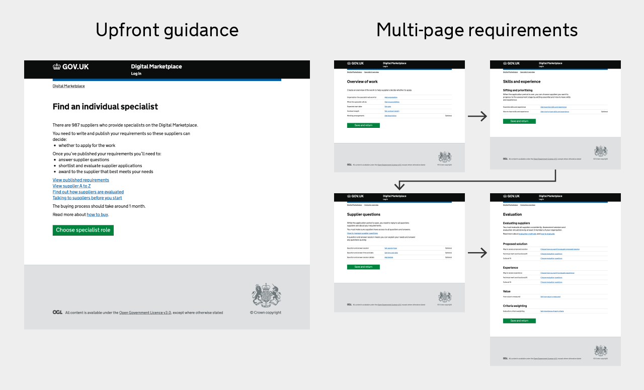
The second thing we learned was that reusing a previous pattern for creating requirements wasn’t making things clearer, simpler or faster for buyers. We redesigned the prototype so that the flow and guidance was split into smaller chunks and spread across several pages instead. Whilst it requires more development effort to build, this tested much more successfully so we expect that the earliest usable product flow might look similar to this:
Showing buyers’ requirements to suppliers
We used the requirements that buyers put together in user research sessions and showed them to suppliers in the lab. They tested well. Suppliers told us:
- after reading the requirements, they had enough information to decide whether to apply for a piece of work
- if they wanted to clarify something, they knew they could ask a question
- the way the information was presented quickly helped them make a decision on whether or not to apply
Delivering the earliest usable product
The initial feedback from user research sessions told us we had extra development work to do which we’ve now planned into our sprints. To meet user needs, we had to simplify the buying journey but in order to do that, we now have to build something more complex. The fourth Government Digital Service (GDS) design principle is ‘do the hard work to make it simple’, and that’s exactly what the team are doing. It’s often more difficult to make things simple for the user but it’s the right thing to do.
Here’s a video example of a user filling out a brief for Digital Outcomes and Specialists.
Transcript:
The user goes to the Digital Marketplace and can see the digital and technology services they can buy. They select ‘find a team to provide an outcome’ and they're taken to a page that shows how many suppliers can provide outcomes. The page also shows information on the steps a user must take to buy the services they need. The user then chooses the location where they want the work to be done. In this case, the user selects London. The user is then asked to create an account or login. They log in and a box appears where they type in the title of their requirements. They then save and continue to the next page. The user is then shown an overview of the process they’ll go through to send out their requirements. On the page there are section headings including ‘write the requirements’, ‘publish requirements’, ‘answer questions from suppliers’, ‘short list’, ‘evaluate’ and ‘award’. The user clicks ‘description of work’ under the ‘write the requirements’ heading. On this page they enter:
- the organisation the supplier will work for
- the business goal the work will support
- why the work is being done
- the problem to be solved
- who the users are and what they want to do
- a description of any work already done
- current phase of the project
- working arrangements
- the expected start date
- contract length
- the budget
The user adds a short description under each of these headers. Some of these questions are optional. When the overview of work is complete, the user clicks ‘save and return’ and is taken back to the overview of work.


2 comments
Comment by Richard posted on
There's no sound on the video?! Or is it just me...
Comment by Gemma Phelan posted on
Hi Richard, no not just you. This is a video showing the user journey without commentary.